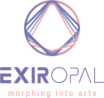
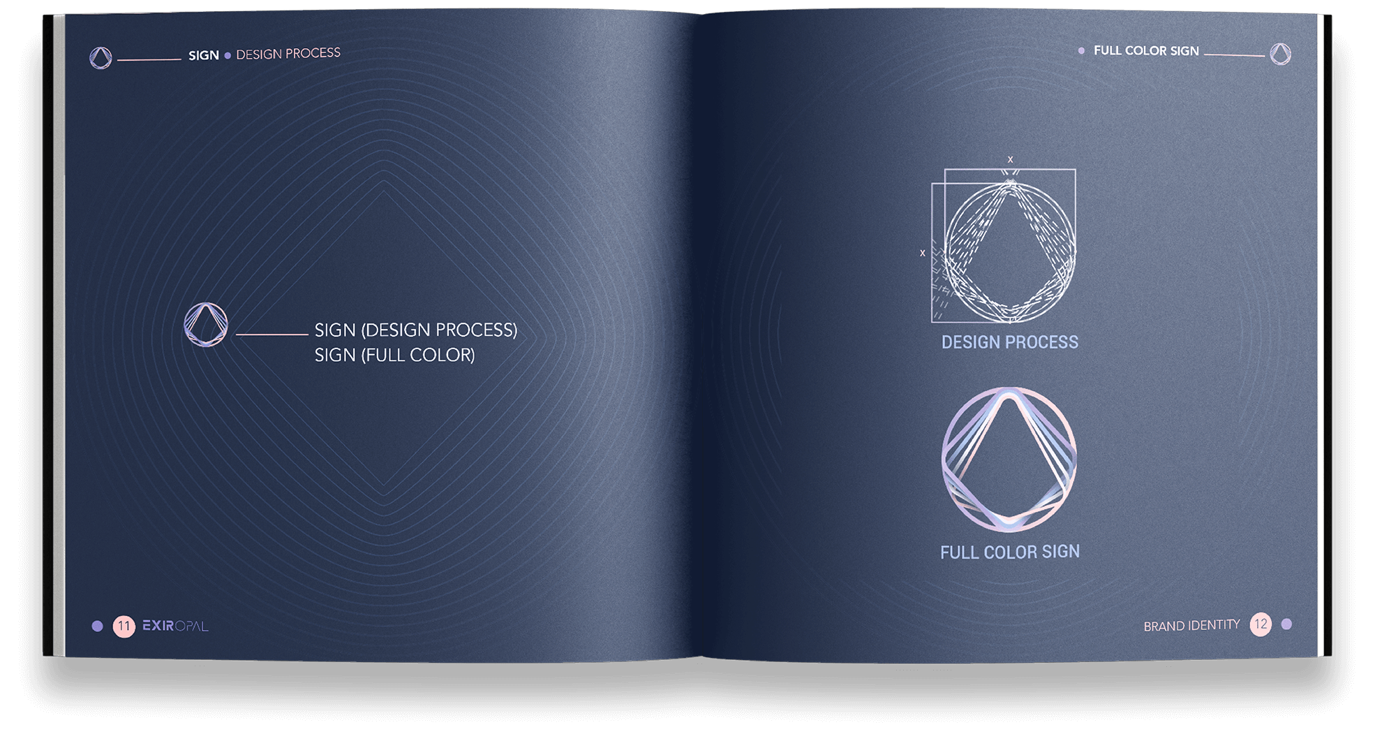
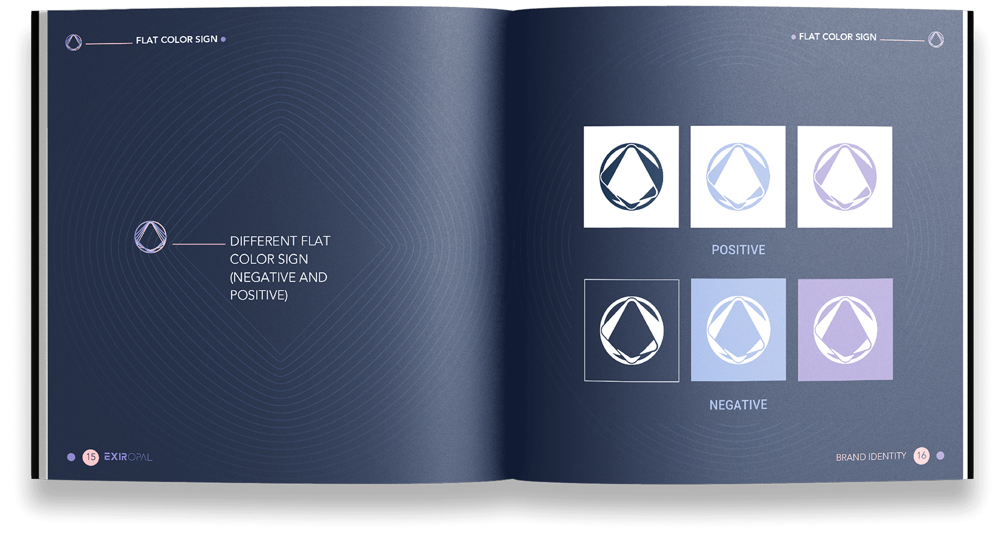
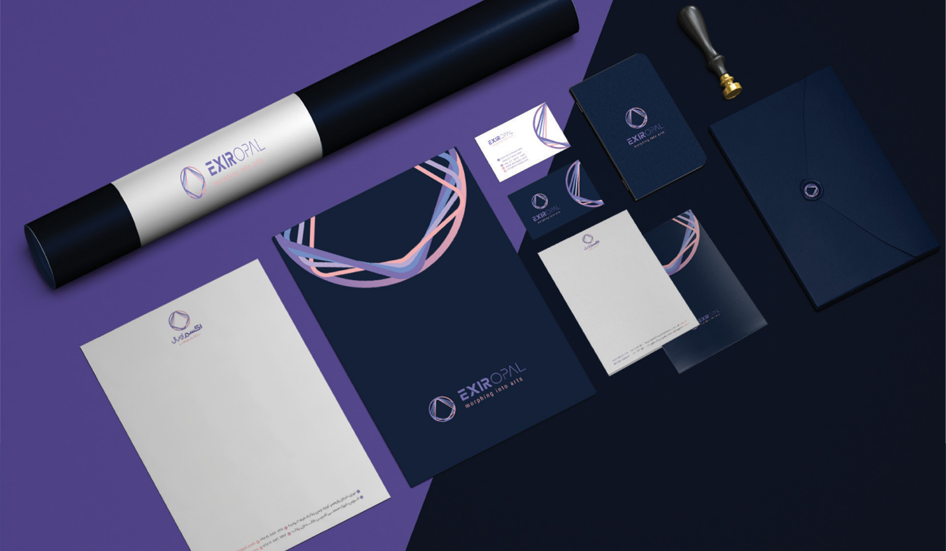
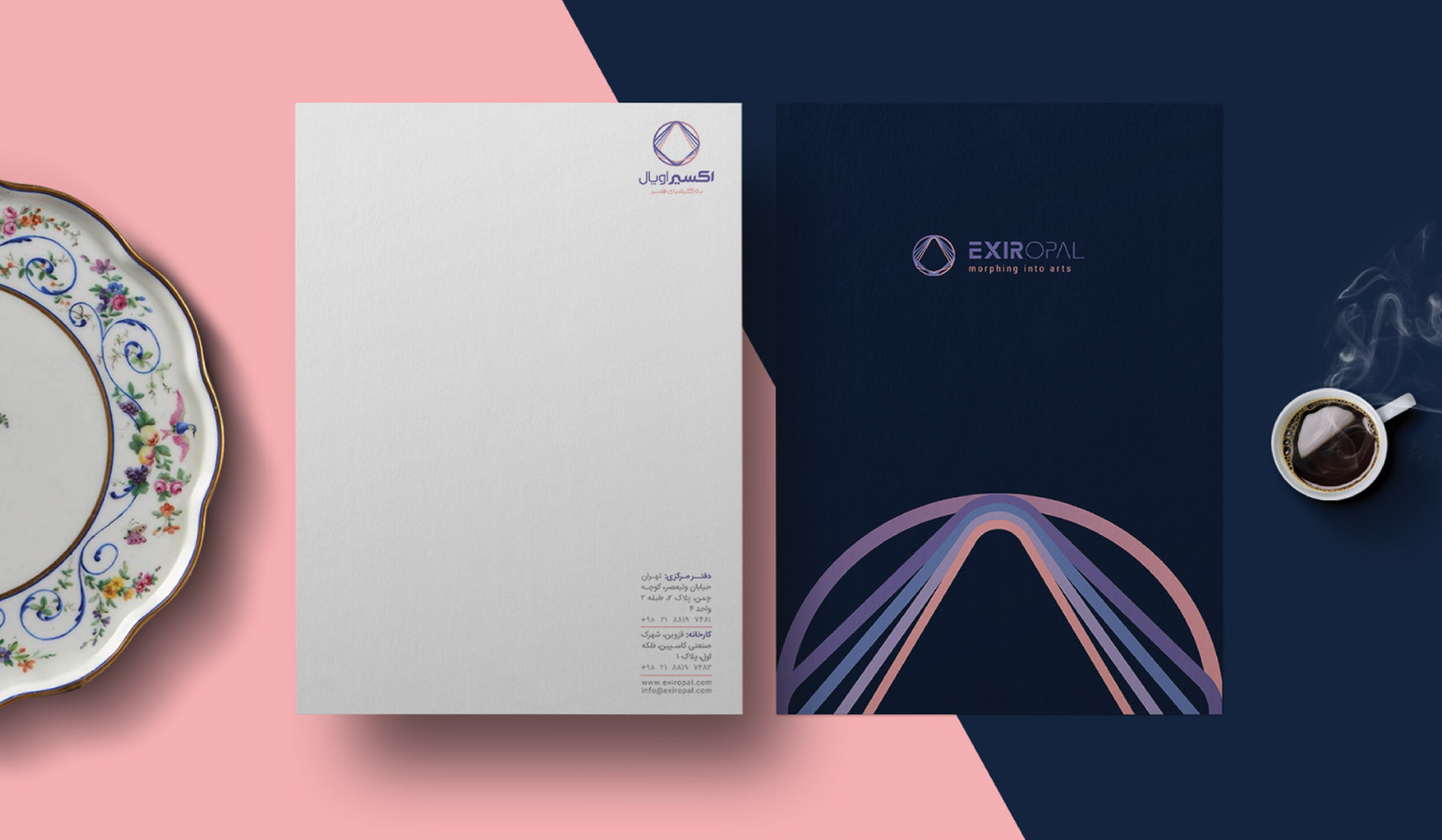
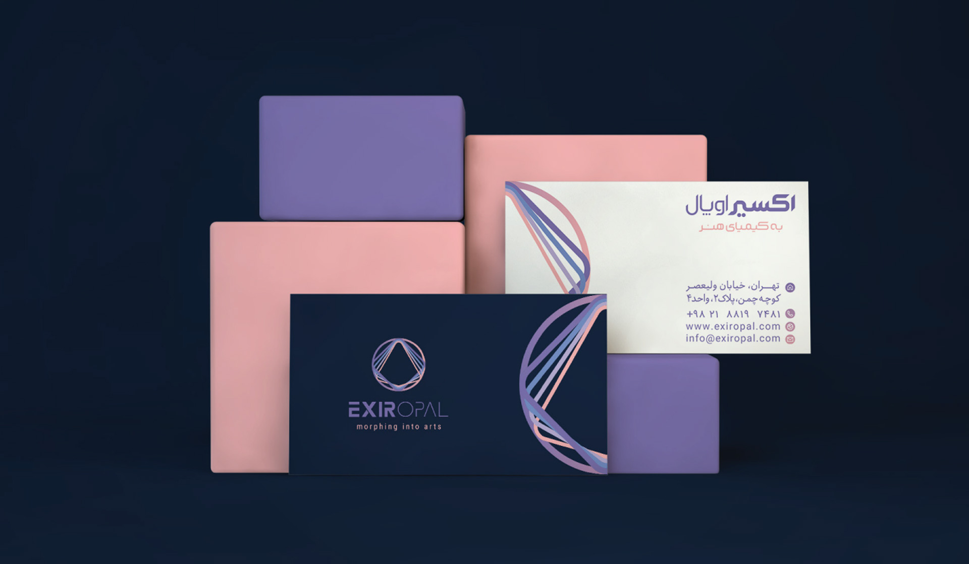
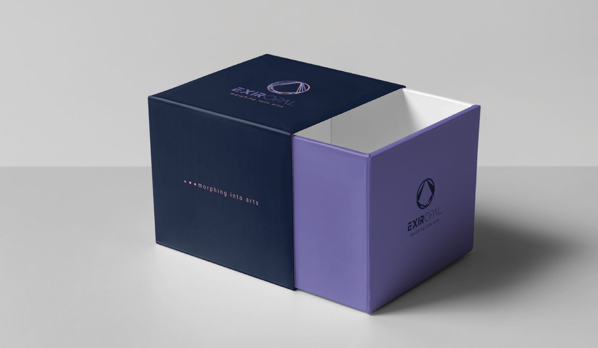
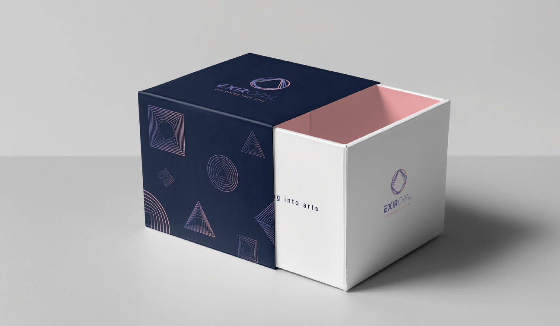
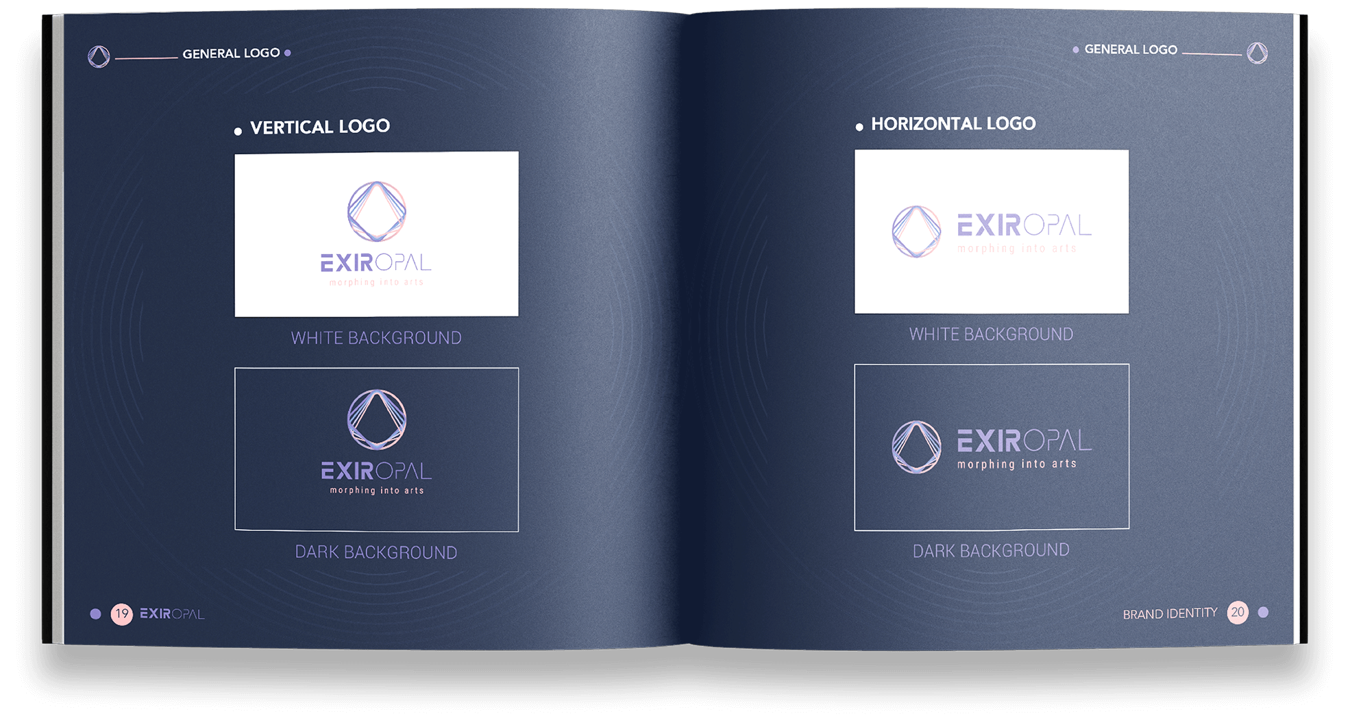
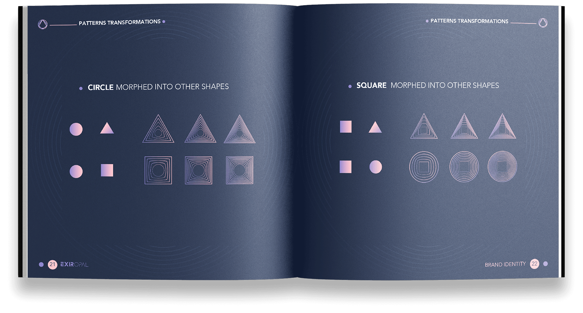
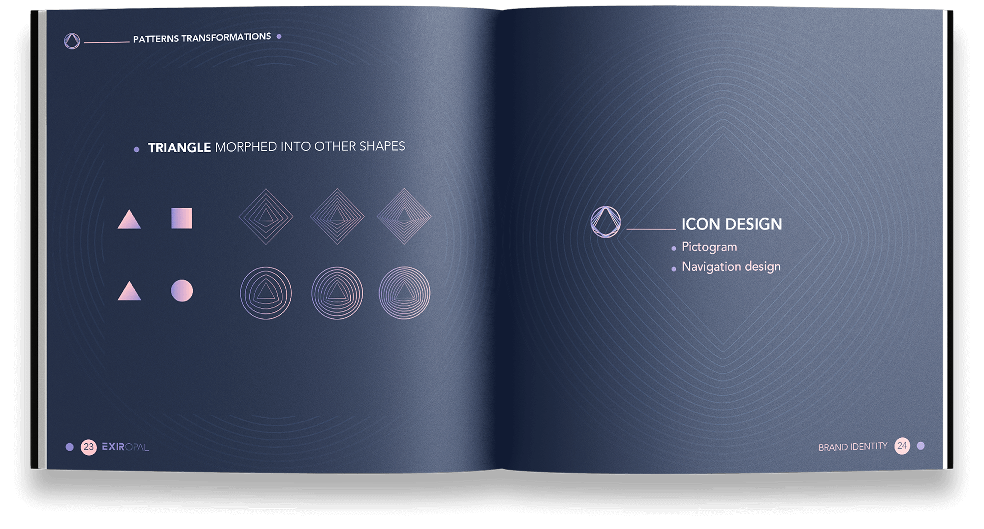
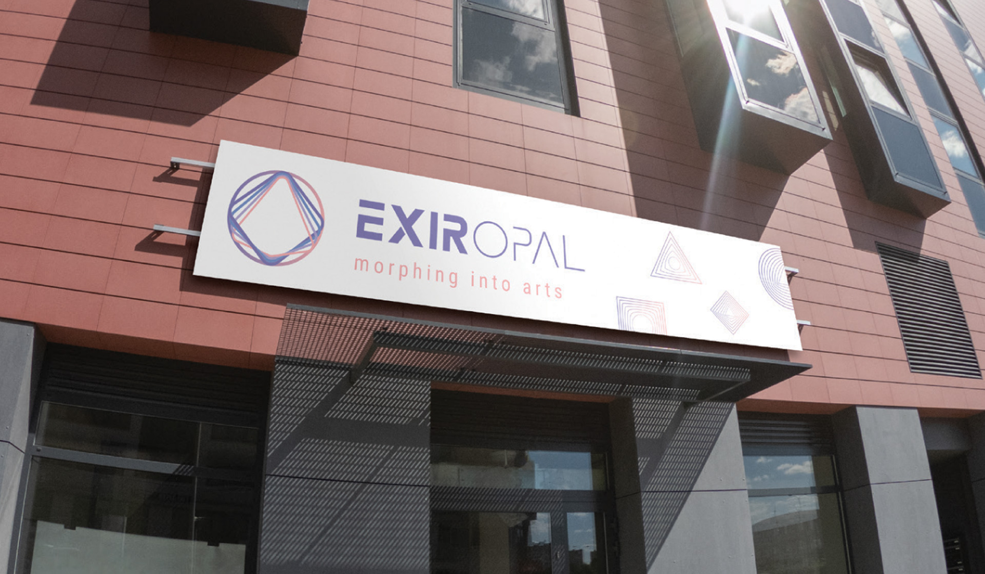
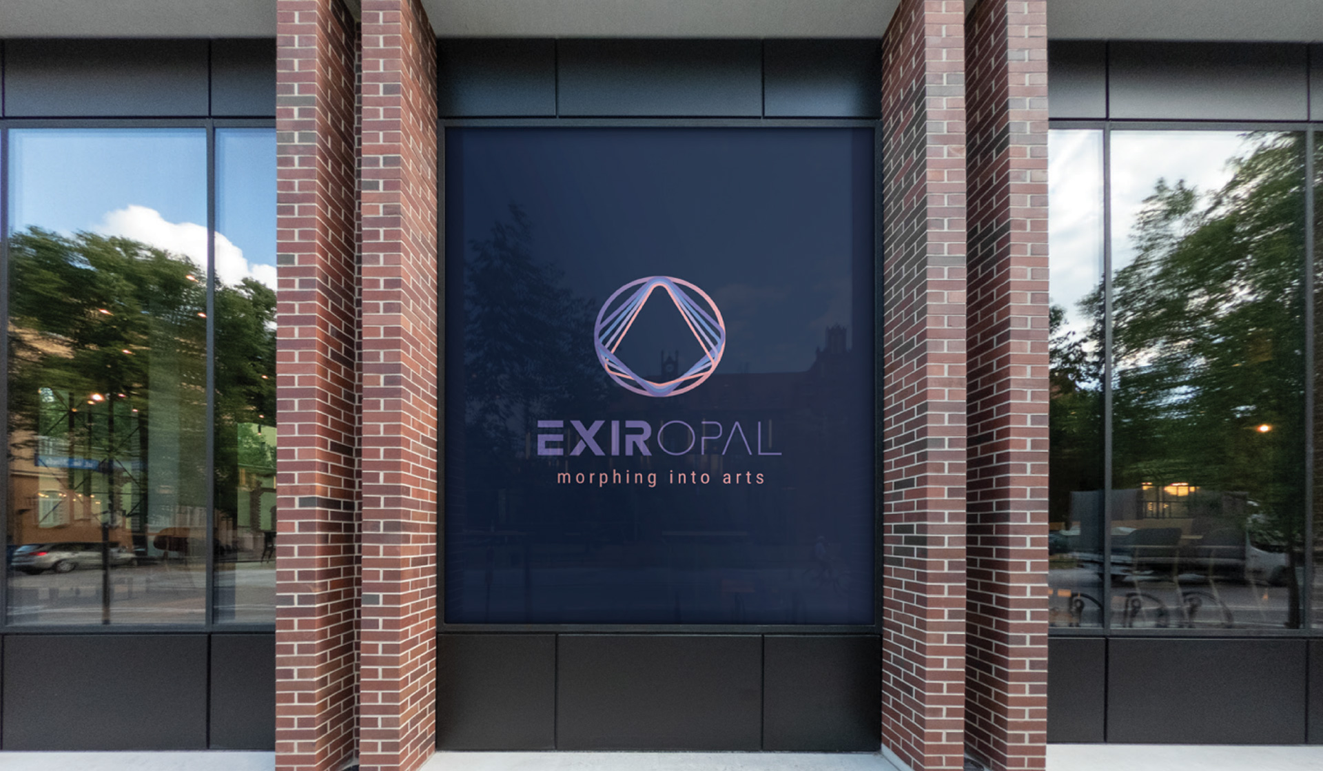
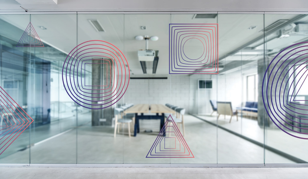
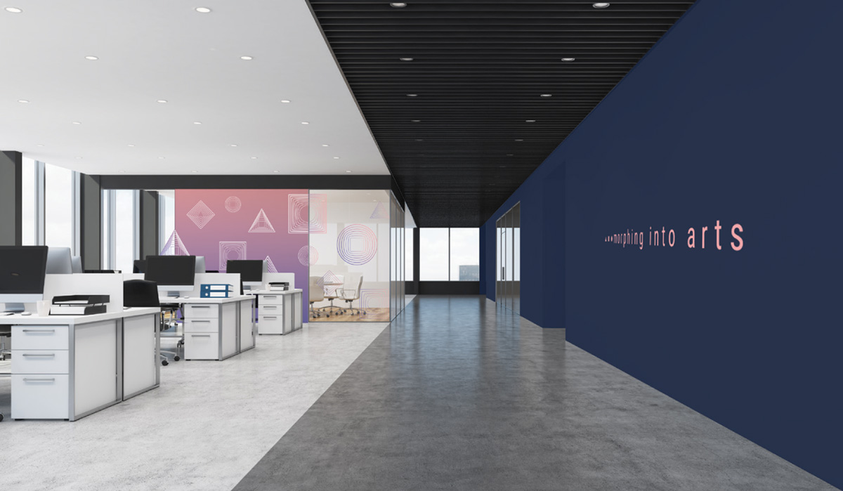
The slogan then became the main influence of the logo. We took three basic shapes: a circle, triangle, square, and illustrated the process of them morphing into one another. This display of motion represents what Exir Opal does in the process of making their products. Not only do the shapes morph into one another, but they do so continuously to represent longevity — linking back to the word ‘exir’.
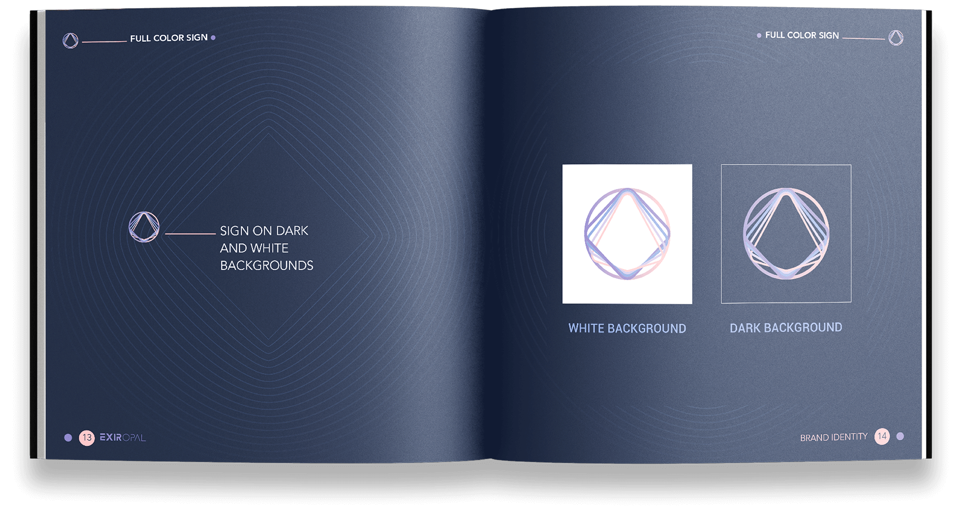
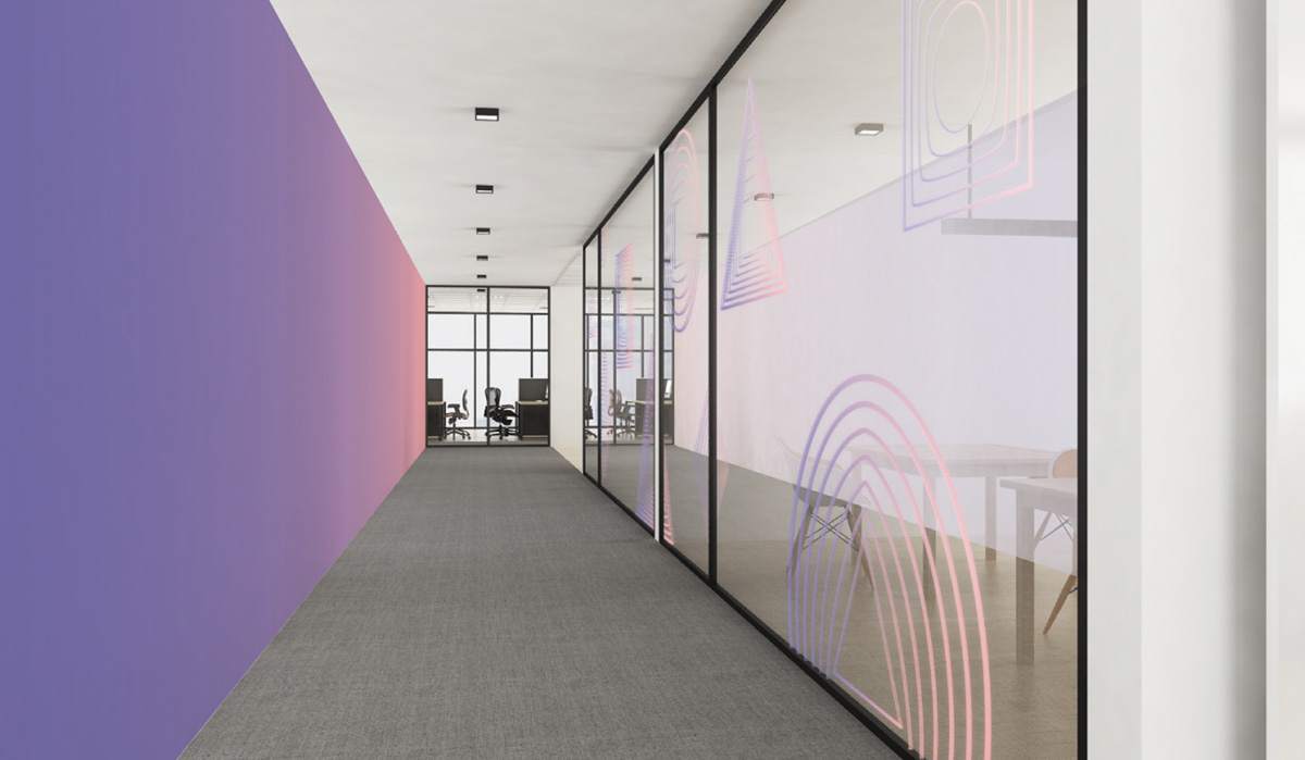
Our choice of color scheme also represents the process, with the use of calm home tones blending into one another.