The importance of inbound marketing for brands

How brand architecture helps companies improve brand value?

COMMUNICATION CHALLENGE

Using the marketing methods of master branding

Large companies with multiple brands or business units can leverage value by cross-association between those brands or business units. One way with which companies do this is by creating an association between their brand visual identities. For example, Virgin derive value for new business units by employing an endorsed brand strategy. To do this, they use their logo beside another sub-logo or descriptor such as Atlantic or Media. The company FedEx use a slightly different way of transferring brand value known as master branding.
This approach results in multiple FedEx logos, each with a slight colour variation and each with a written service descriptor beside.

LOGO INSPIRATION

GENERAL LOGO

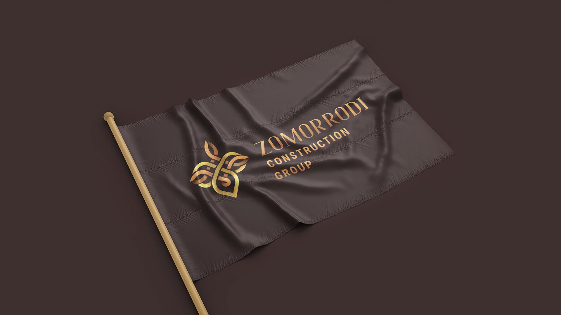
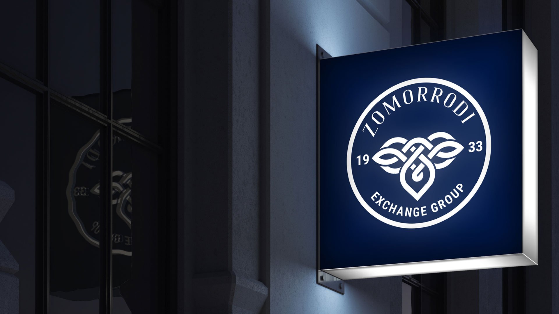
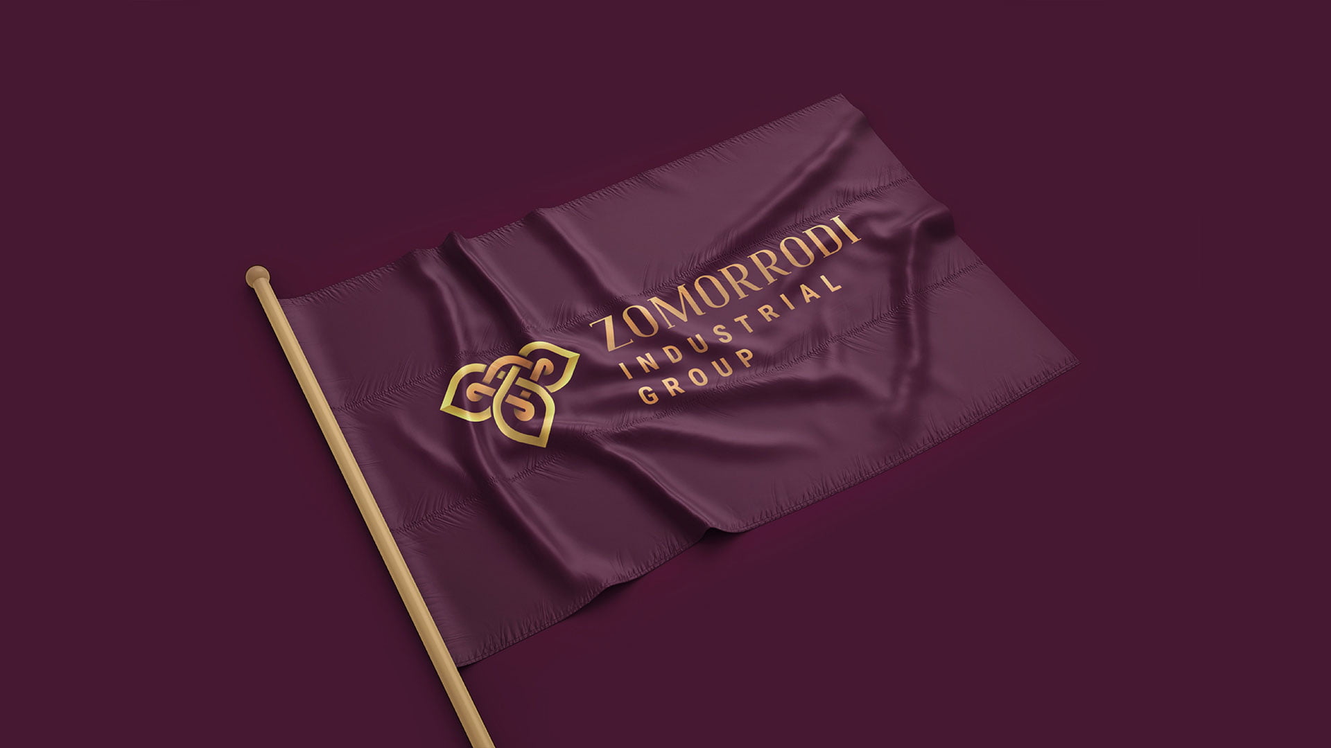
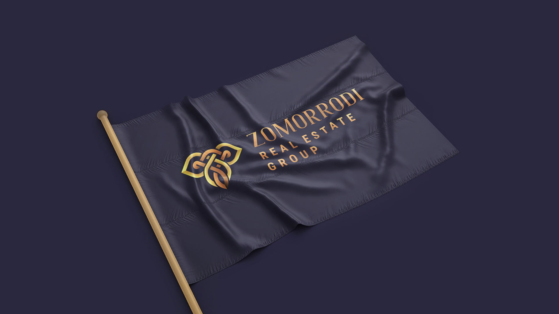
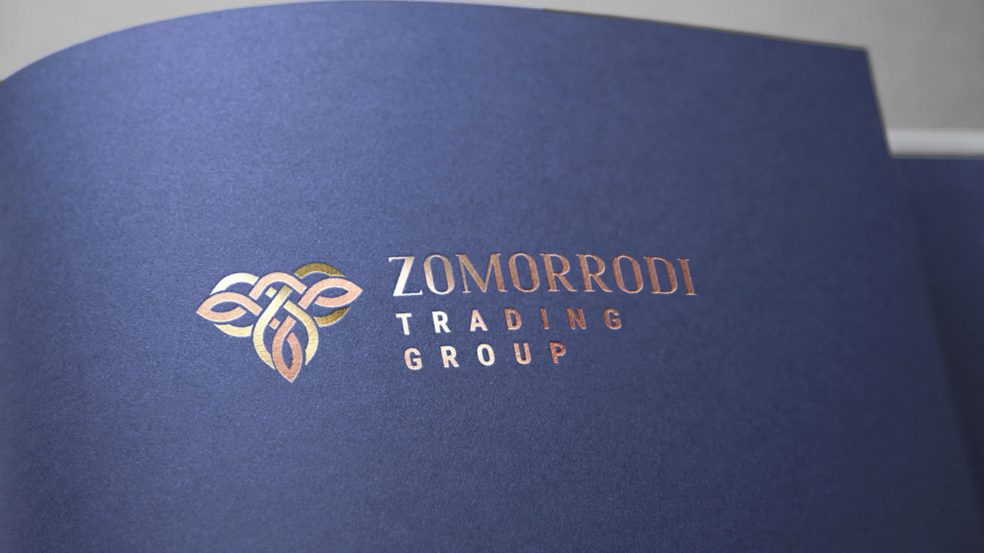
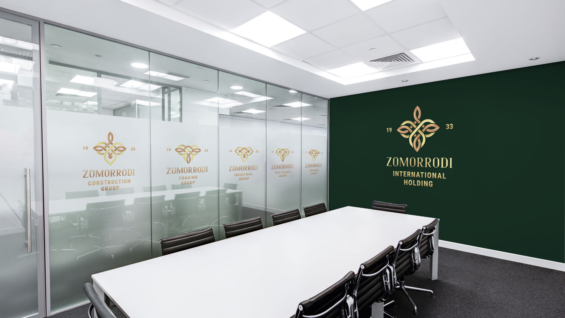
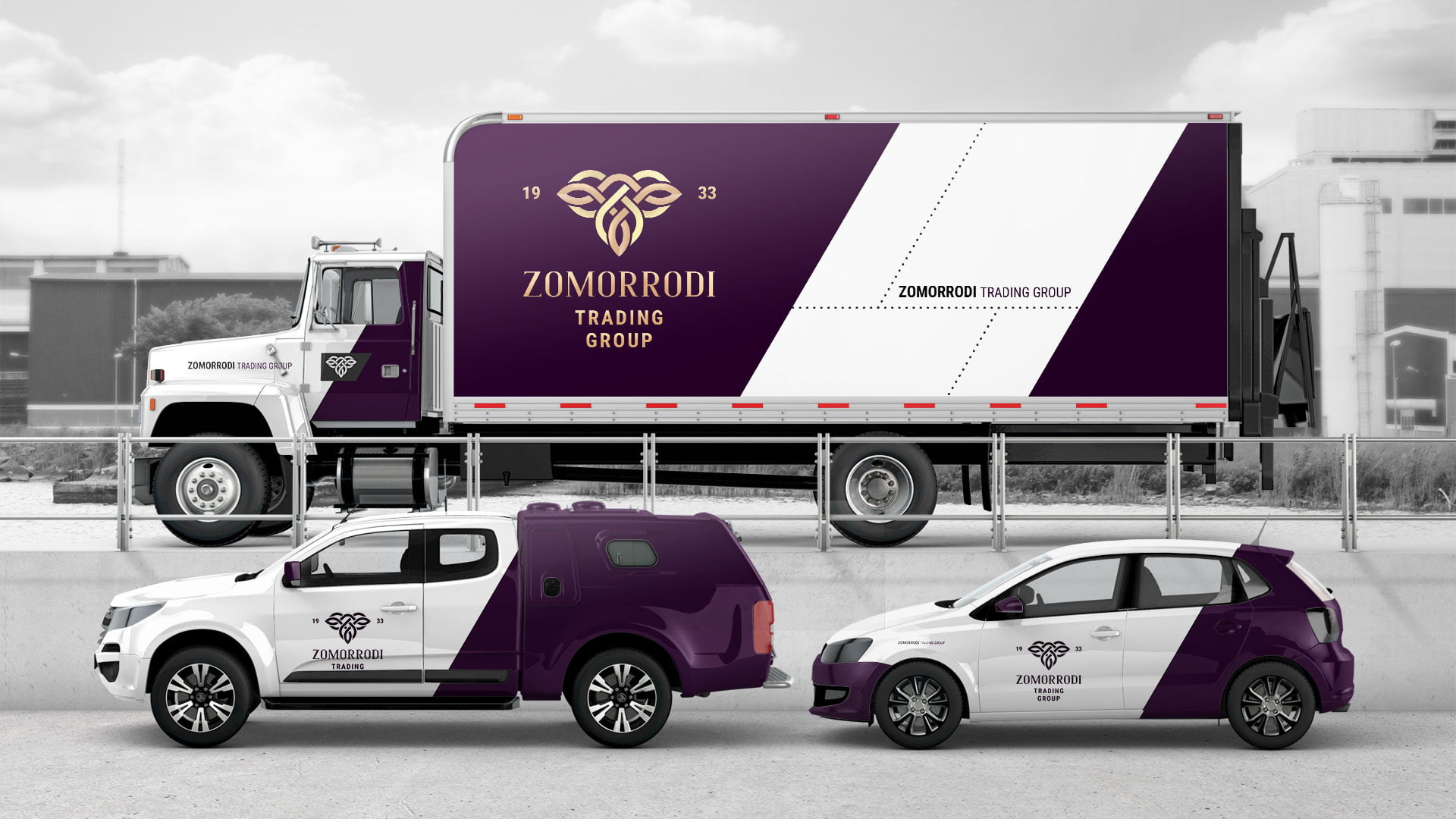
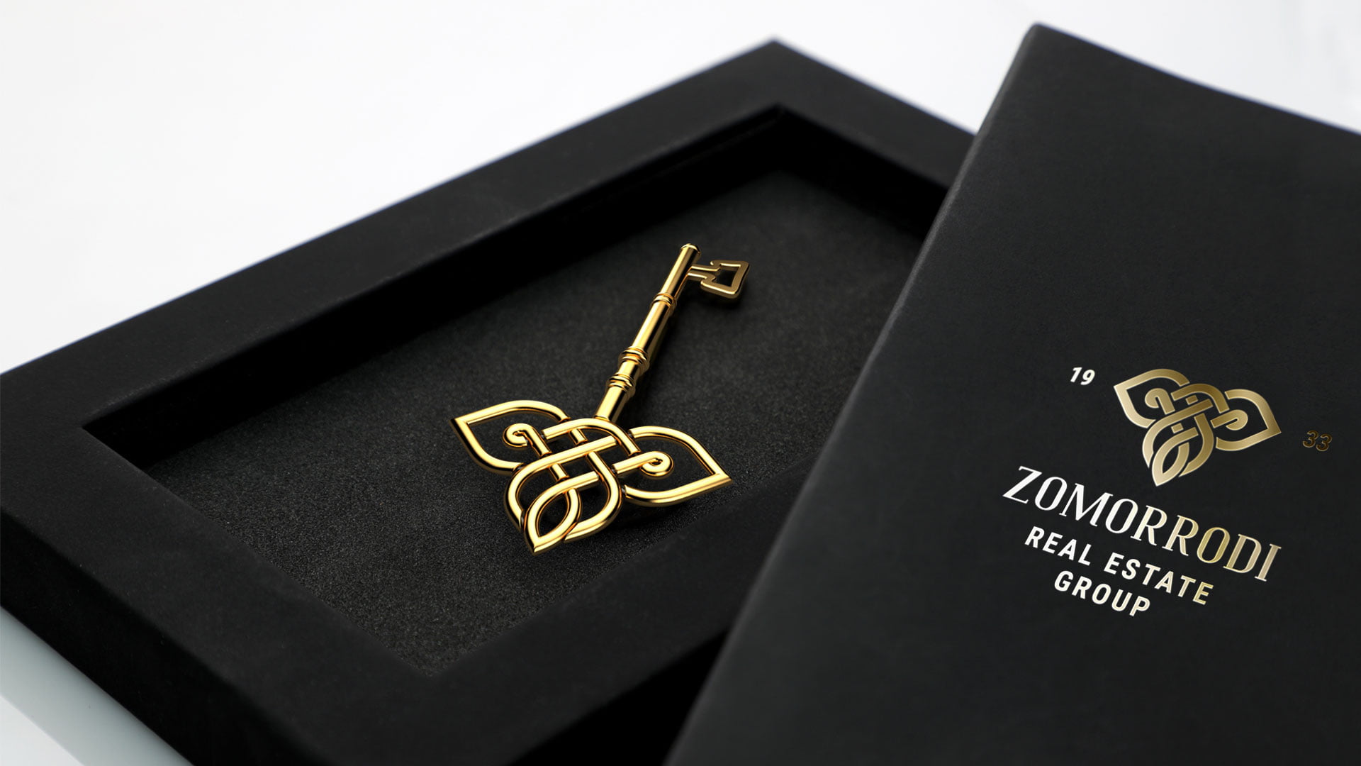
MOCKUPS

Solving growth problems for brands

It was very likely that these global brands faced a similar strategic necessity to the Zomorrodi Trading Group. This historic company has developed several business units across semi-related categories throughout their many years of business. Although each business unit has claimed a level of dominance in their respective fields, some have been more successful at establishing this dominance than others. This situation has created two problems along the way, however. Firstly, some business units would negatively transfer brand value by incidental matters, such as lack of dominance in a category. Secondly, the Zomorrodi Trading Group brand architecture was never defined, which until recently led to miscommunications between respective business units.
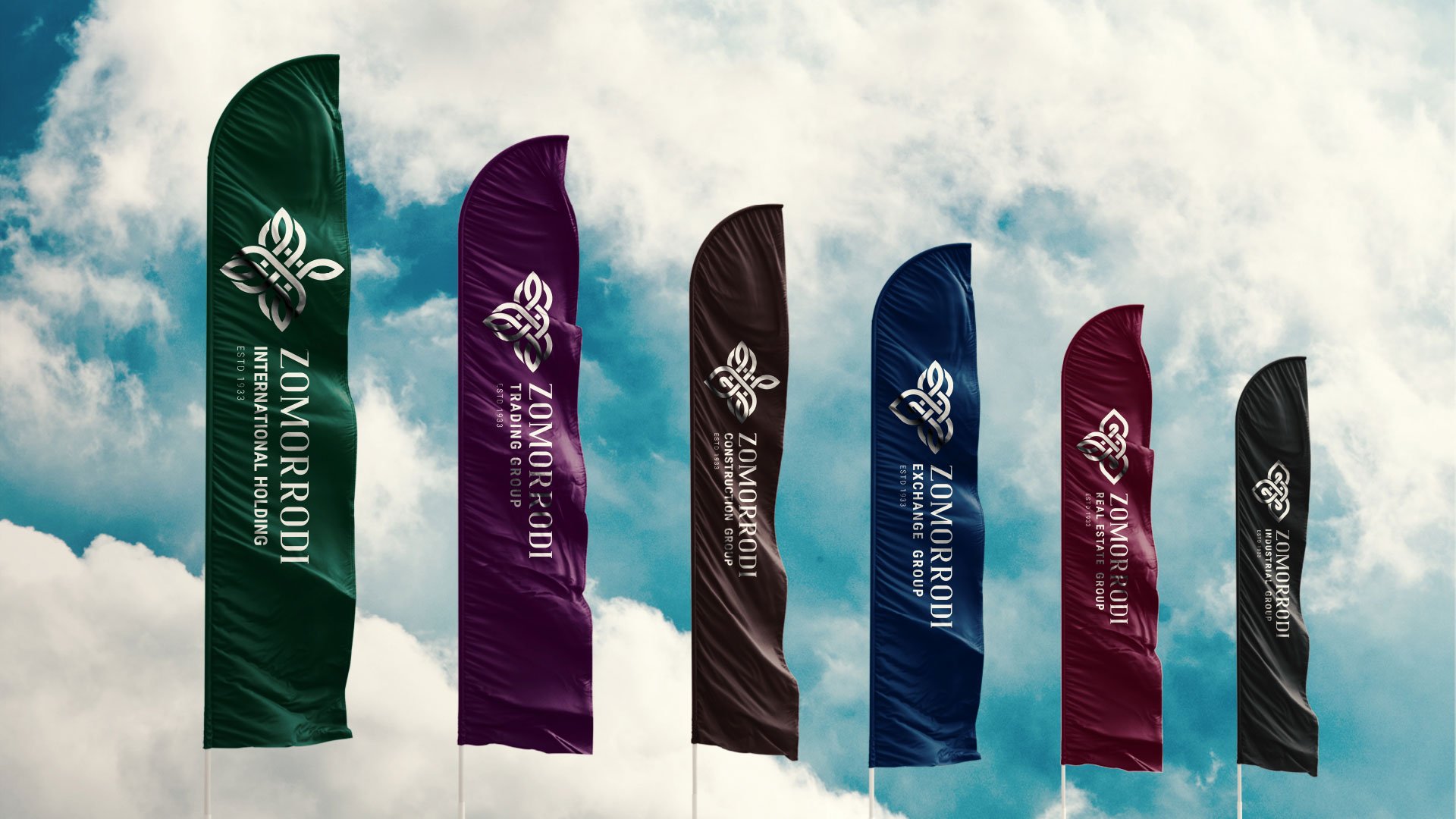
SUB BRANDS AND BRAND COLORS

1. ZOMORRODI CONSTRUCTION GROUP

#221514
ZOMORRODI CONSTRUCTION GROUP

BACKGROUND COLOR

2. ZOMORRODI TRADING GROUP

#231125
ZOMORRODI TRADING GROUP

BACKGROUND COLOR

3. ZOMORRODI EXCHANGE GROUP

#051637
ZOMORRODI EXCHANGE GROUP

BACKGROUND COLOR

4. ZOMORRODI REAL ESTATE GROUP

#2e1218
ZOMORRODI REAL ESTATE GROUP

BACKGROUND COLOR

5. ZOMORRODI INSDUSTRIAL GROUP

#181818
ZOMORRODI INDUSTRIAL GROUP

BACKGROUND COLOR

Zomorrodi use a top advertising agency to help stay on top

To solve these communications challenges and to help improve brand value, Zomorrodi approached us at Zigma8 to utilise our experienced branding team.

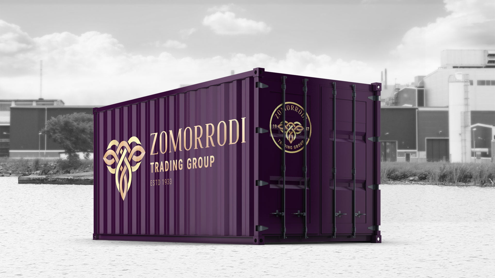
MOCKUPS

COMMUNICATION SOLUTION

Building value in advertising based on brand heritage

To help solve these challenges, our branding team strategically took the master brand approach. By doing this, Zomorrodi would leverage its heritage within a uniformly branded style while also providing subtle differentiation between each business units. This method would also help invite a feeling of grandeur, something that this long-standing brand usually evokes.

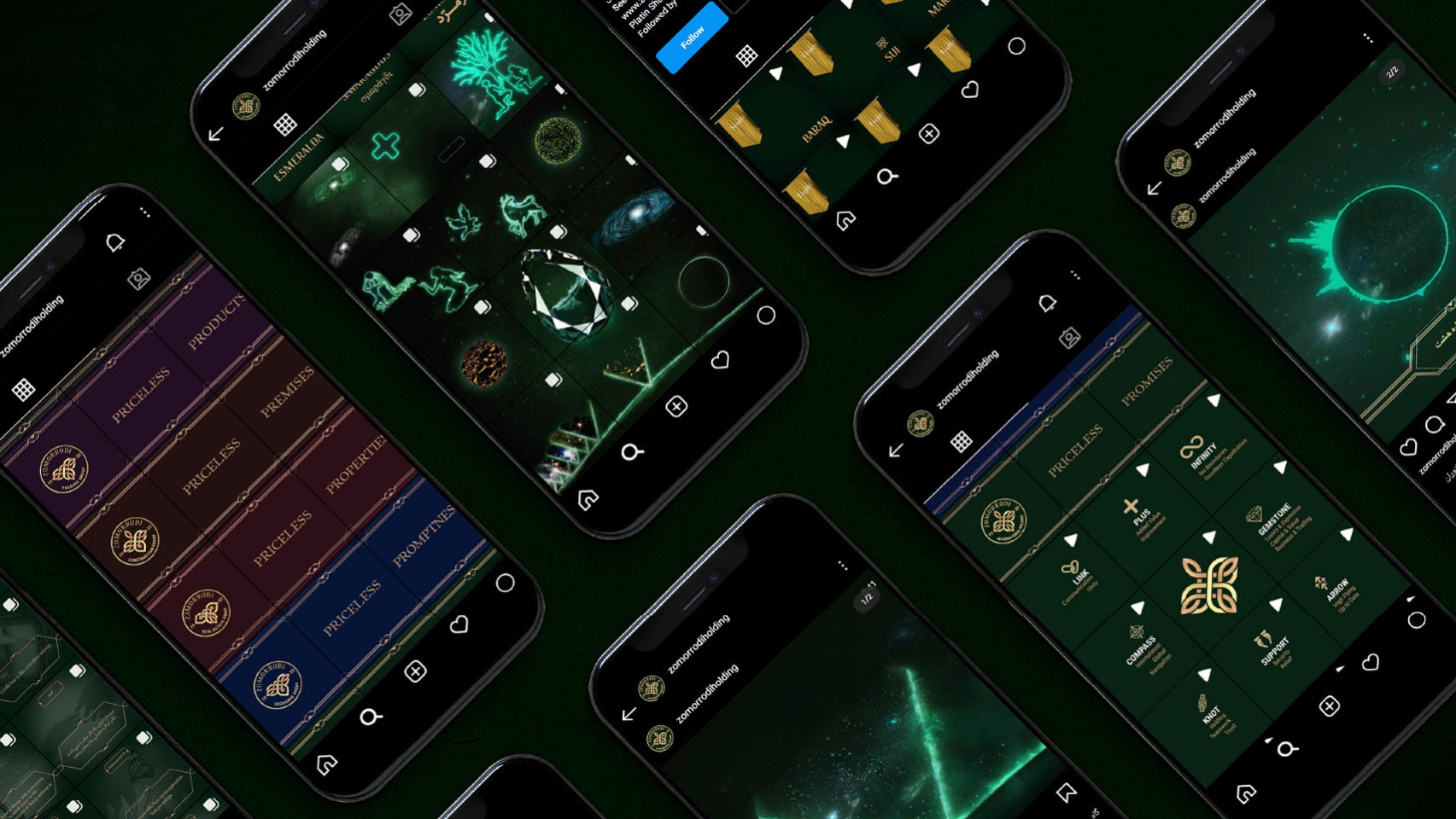
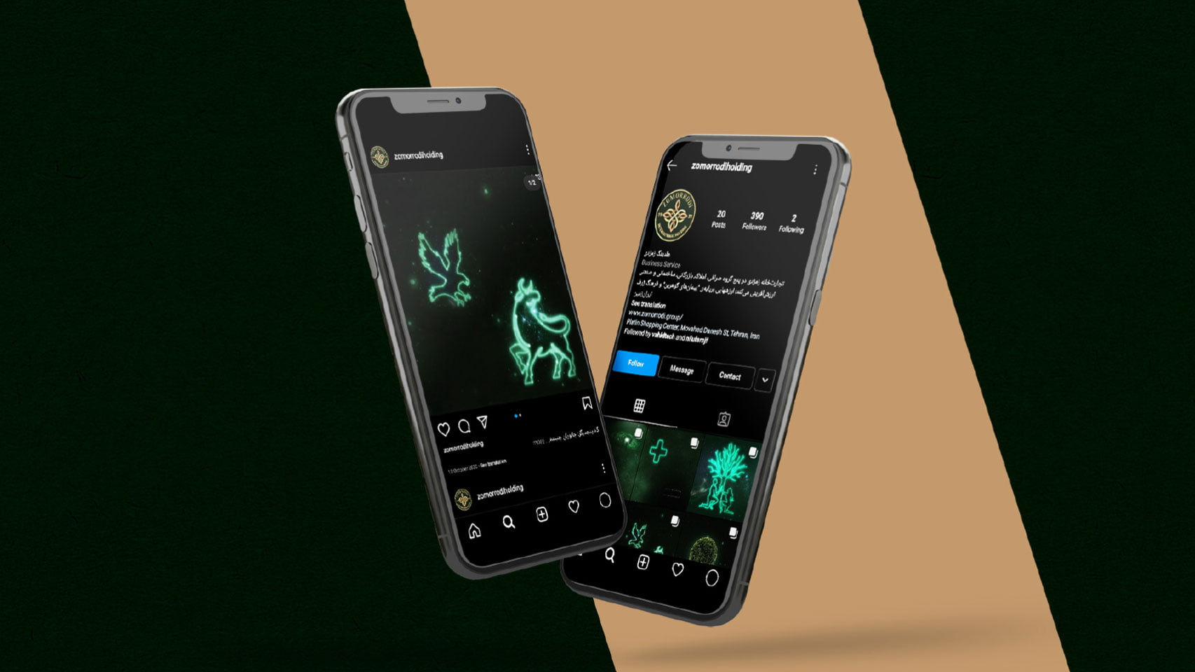
SOCIAL MEDIA

Associating the brand story to real stories for inbound marketing

Our branding team also helped support the feeling of grandeur by founding the visual identity on a shared heritage story. This story goes back two generations and begins with the company founder, Mr Zomorrodi. His family name translates as emerald, relating to the precious stones that the late grandfather would cut for a living. From that day to this, the company has enjoyed an intergenerational legacy — a legacy of human values. It is these values that form the shared heritage story with ancient Persian culture.

Advertising the Zomorrodi brand story

To embody this legacy within the brand, we encapsulated the brand essence by associating it with the values of Zoroastrianism. We used the principles from this ancient Persian religion to represent the Zomorrodi brand essence in a series of inspirational videos. Each video told a shared value story in the style of an expansive emerald coloured universe.

Creating visual identity with 'master branding' marketing method

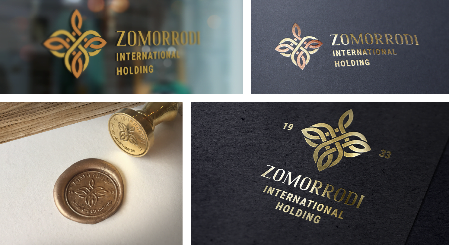
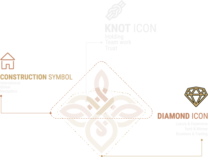
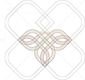
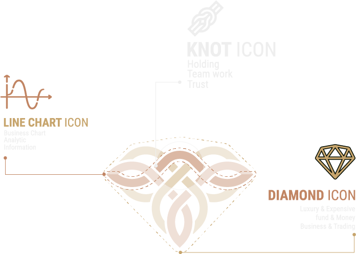
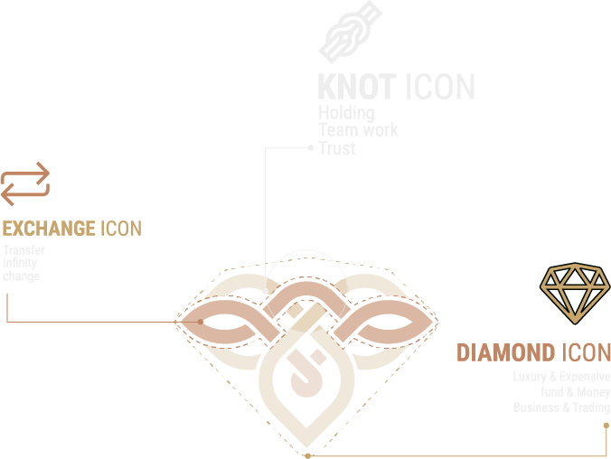
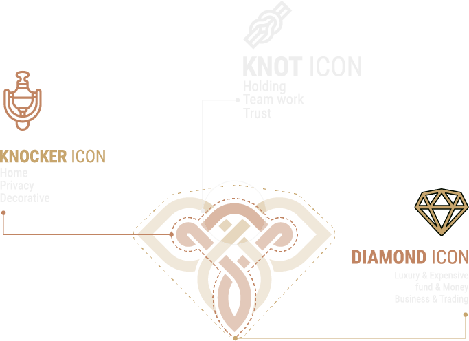
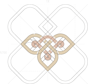
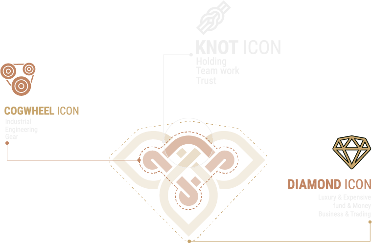
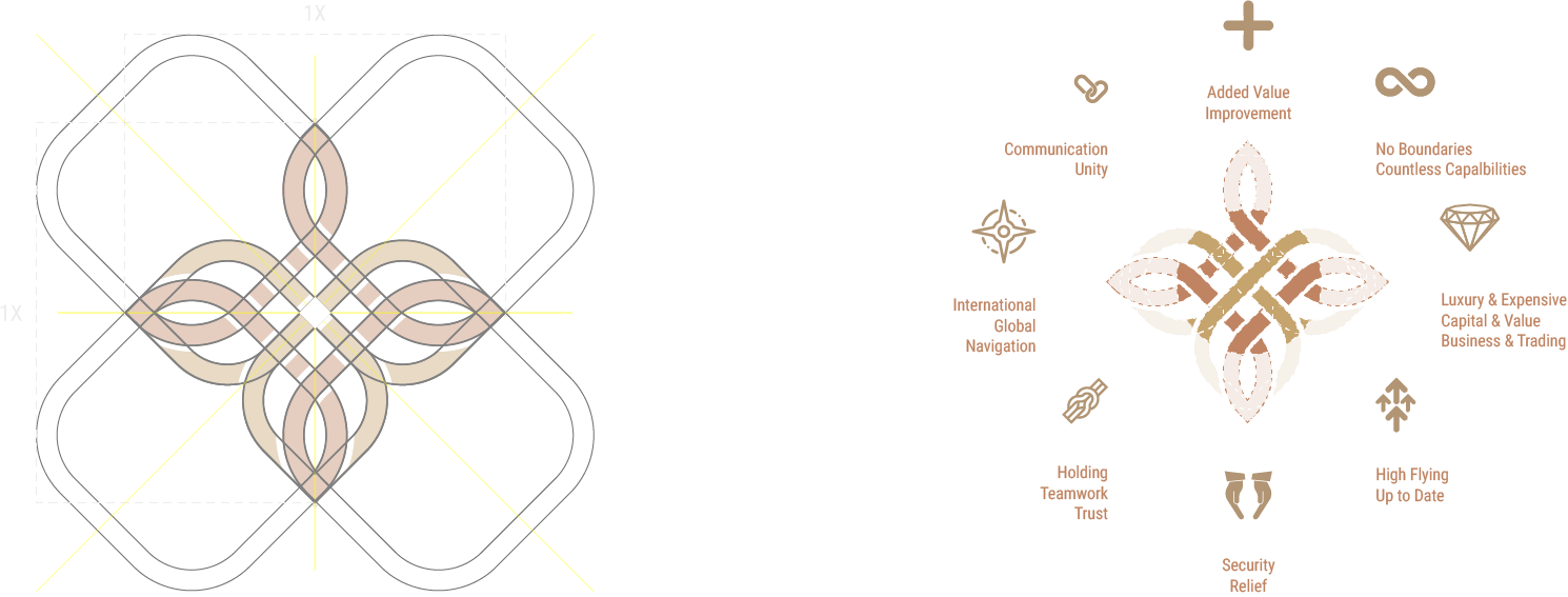
In addition to the Zomorrodi brand essence, we created a visual identity which in part, relates to ancient Persian motifs. This identity would be represented in the logos by knot-work patterning — something is also seen with historic Persian jewellery. Each business unit had its knot-work design created for them, each with a subtly different look. By doing this, Zomorrodi would transfer brand value via the master branding method while simultaneously encapsulating a feeling of family.
To complement the Zomorrod family of logos, our design team also devised a colour palette that would centre around the emerald colour, using complementary tones for each business unit.